
Three hands-on palette checks I use to spot rising color stories before they turn into a pile of unworn almosts.
The fitting-room lighting test I trust more than my mirror
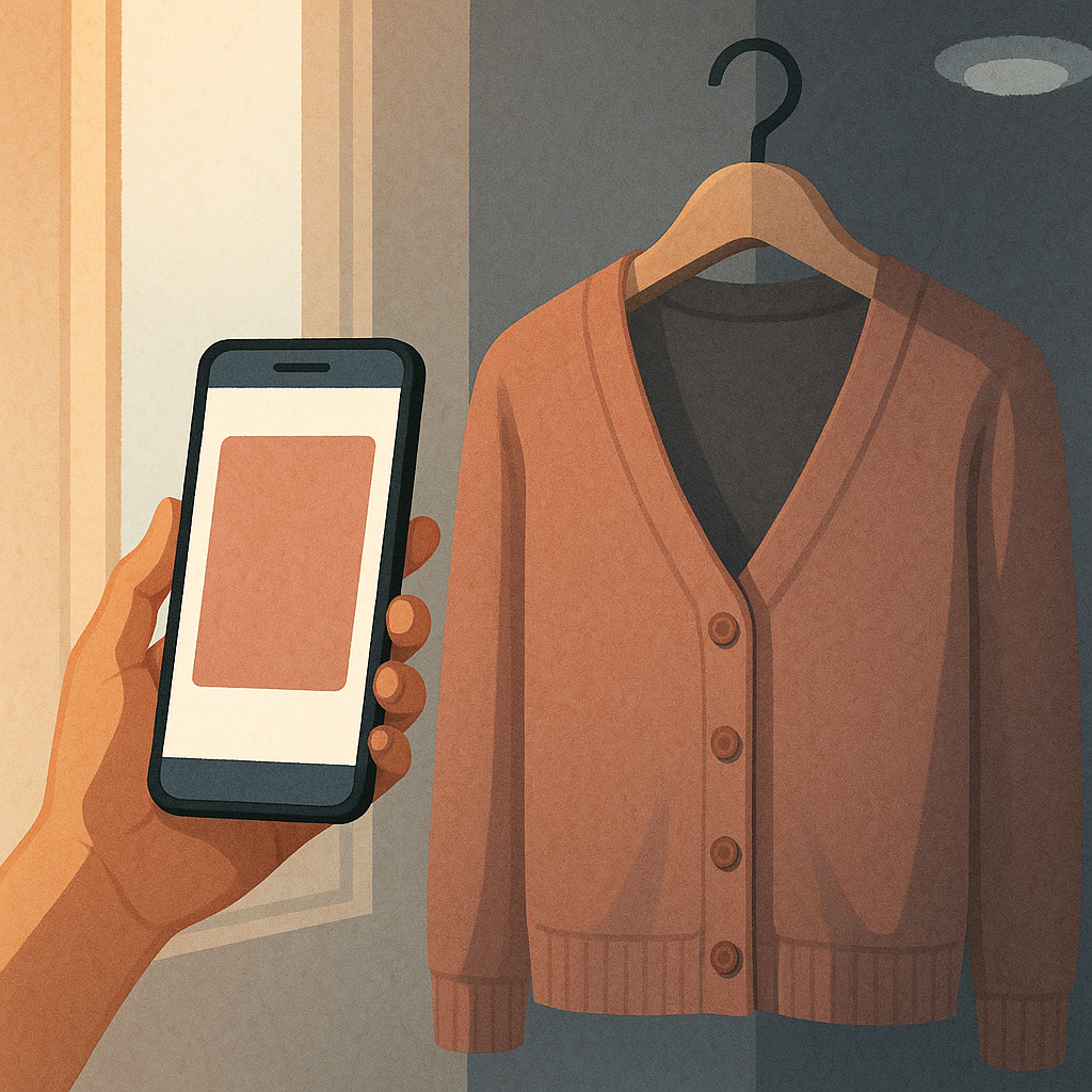
I used to think I had a “good colors” problem. Turns out I had a lighting problem. If you try on a dusty rose cardigan in a fitting room with warm bulbs, it can look like a soft, flattering neutral. Step outside, and suddenly it reads like Band-Aid. That whiplash is how I started catching palette shifts early, because the colors that are gaining momentum tend to be the ones that still look intentional when you move them through three kinds of light: warm indoor, cold indoor, and daylight.
Here’s the routine I do with anything that’s part of a new color story I’m tempted by (but especially the pale, murky shades that are everywhere right now): take it to the front of the store near the windows, then back under the harshest overheads, then check it next to my phone screen at full brightness on a white page. I’m not hunting for perfection. I’m watching for the moment the color collapses into gray or goes oddly yellow. If it can’t hold its identity, I know it’ll be hard to style at home because my closet has mixed lighting too. My bedroom is warm. My hallway is cool. The mirror by the door is basically an interrogation lamp.
This is also where I separate two palettes that look similar online: “spiced” neutrals (cinnamon, tobacco, nutmeg) versus the newer, flatter versions that lean pink-beige. The spiced group survives terrible lighting because there’s a little depth in it. The pink-beige group needs perfect conditions. If a shade only looks right under one bulb type, I treat it like a special-effect color, not a new everyday neutral, and I buy it like I buy sequins: one piece, max, and only if I already know what it replaces.
Stop matching your closet. Match your accessories first.
When a new palette starts bubbling up, everyone talks about “what goes with your wardrobe.” I think that’s backward. Your wardrobe is flexible. Your accessories are stubborn. Leather has a mind of its own. Hardware has undertones. And shoes will expose a trending color faster than any mood board because shoes don’t politely blend. They either work or they make you look like you got dressed in the dark.
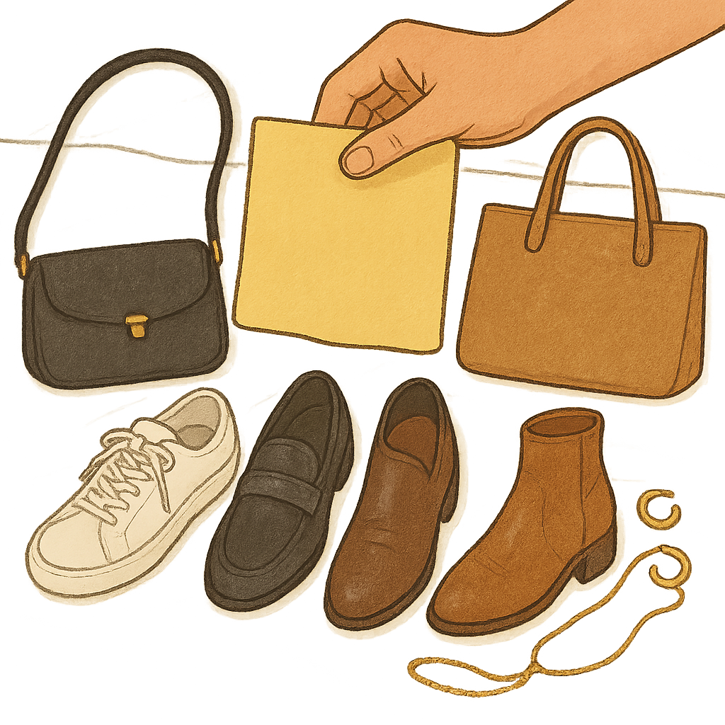
I do a floor test at home that takes maybe two minutes: I put the new color (or a close stand-in) on my bed, then line up my three most-worn pairs of shoes and my two most-used bags underneath it. For me, that’s usually white sneakers, black loafers, and a brown boot, plus a black crossbody and a tan tote. Then I add my everyday jewelry, because gold and silver can be a dealbreaker with certain “in-between” tones. I’m not trying to create outfits. I’m trying to see if the palette is going to demand new supporting purchases.
Example: butter yellow is having a moment, but it can read sour next to bright white shoes and can look oddly dingy with some cool-toned silvers. On the other hand, it plays surprisingly well with warm gold and medium brown leather. That tells me who will wear it easily: someone whose closet already leans warm in accessories. If your daily drivers are stark white sneakers and silver hoops, butter yellow may turn into a closet orphan fast.
Same deal with the current wave of soft, foggy blues. They photograph like a dream. In real life, they can fight with black shoes in a way that feels corporate, not cool. If you can’t stand the look of that color sitting above your most-used shoes, don’t buy the statement coat in it. Start with a top that can hide under a jacket, or skip it entirely. Trends don’t fail because the color is bad. They fail because your accessories don’t want to come along.
Two swatches tell me if a palette is peaking or just starting
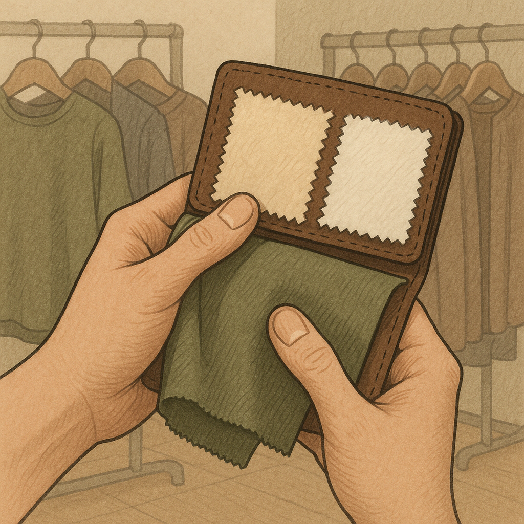
I don’t bring paint chips into stores anymore because I don’t need that level of theater. But I do keep two tiny fabric swatches in my wallet, both cut from old tees I was already turning into rags: one warm off-white (think ivory) and one cool off-white (think optic white). That’s it. Those two scraps tell me whether a rising color palette has legs, because they reveal undertone honesty immediately.
When a new color story is early, brands haven’t standardized it yet. You’ll see five versions of “the same” olive, and half of them are secretly gray-green. You’ll see chocolate browns that pull red next to ivory but go flat next to optic white. That variability is the clue. Early-phase palettes are messy. Late-phase palettes get overly uniform, then they flood every rack in the same safest version until you can’t unsee it.
Here’s how I use the swatches: I hold the garment against the warm swatch, then the cool swatch, and I watch which one makes the garment look cleaner. If a supposed neutral only behaves next to one temperature, it’s not a true closet-building neutral for most people. It’s a character color. And character colors are fine, but they’re the ones I buy secondhand later, after the trend crests and the resale market fills up with barely-worn mistakes.
This trick also catches the palettes that are sneaking in under the radar. A lot of the new “quiet” colors (mushroom, clay, fog, oat) live or die on undertone. If mushroom looks green next to warm off-white but purple next to optic white, it’s going to be hard to wear unless your closet already has a strong temperature bias. When I find a shade that stays steady against both swatches, that’s when I pay attention. That’s usually the version that ends up becoming the default two seasons later, long after everyone swears they’re tired of it.