
Three places I hunt cross-industry signals before fashion copies them: hotel lobbies, coffee menus, and car interiors.
Hotel keycards are my fastest color forecast
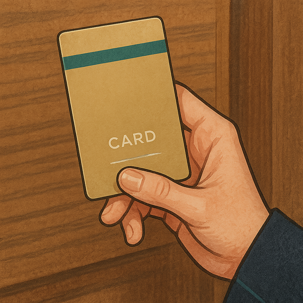
I started doing this by accident on a work trip when I realized the hotel keycard looked like it was designed by the same person who signs off on sneaker boxes: matte finish, one clean accent color, a tiny hit of metallic, and a typeface that feels like an app update. Hotels have a problem fashion also has: you can’t redo everything every season, so you pick a palette and live with it across print pieces, uniforms, carpets, and that little card everyone touches. When I want to spot where color is moving before it hits mall racks, I look at three things in the same five-minute sweep: the keycard, the front desk backdrop (tile, stone, or wood tone), and the staff uniform piping. Then I compare it to what brands are pushing in their seasonal lookbooks.
What I’m watching for isn’t a single color. It’s the way a color is used. For example, I’ve been seeing a lot of smoked teal and inky green showing up as a micro-accent in hotel branding: one stripe on the card, one line on signage, one thread of embroidery on a blazer lapel. That tells me it’s being treated as a confident neutral, not a statement. In the deal-hunting mindset, that’s useful because accents migrate into mass-market accessories first. If I’m mapping across industries, that little hotel accent often shows up 6 to 12 months later as the color of zipper tape, sneaker heel tabs, nylon totes, and the lining on a jacket that gets called “sage” even when it’s not.
My practical move: I set a resale search for that accent color plus material words that match how hotels use it (matte, coated canvas, nylon, microfiber). When listings start appearing from multiple brands at once, it usually means the mills are offering the same dyed goods to everyone. That’s when I stop buying full-priced versions and wait for the first end-of-season markdowns, because the color is about to be everywhere, and you don’t need to pay early-adopter prices for what will become a default option.
Oat milk menus tell me which neutrals are about to get renamed
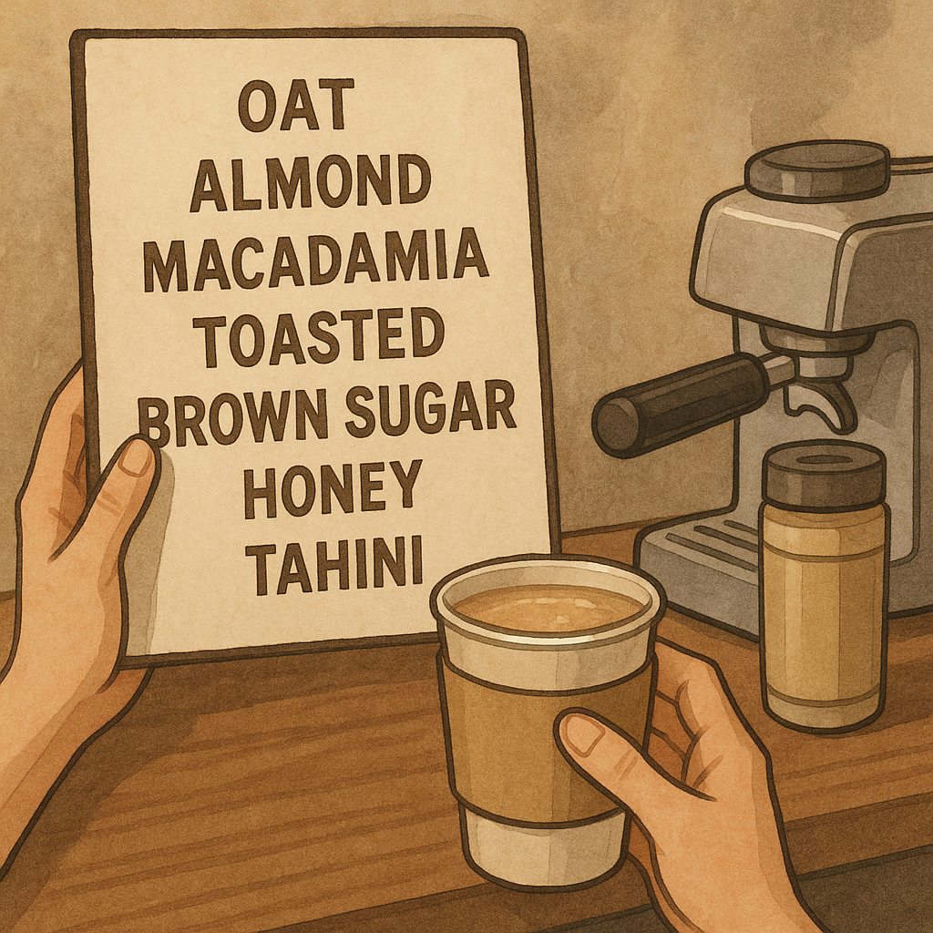
Coffee shops are quietly doing trend translation in public. They have to name colors and textures all day long in a way that sounds appetizing, and those names have a way of escaping into everything else. I don’t mean the obvious pumpkin-spice stuff. I mean the beige spectrum getting broken into a dozen distinct choices: oat, almond, macadamia, toasted, brown sugar, honey, tahini. When a cafe starts describing a drink as “toasted” anything, that word shows up in product copy everywhere because it solves a retail problem. It makes a neutral feel intentional and warm without saying beige, which people are tired of admitting they buy.
Here’s how I map it into shopping decisions. First, I look for the exact shade on the barista tools and packaging, not the drink itself: cup sleeves, paper bags, napkin dispensers, the rubber grip on the portafilter handle, even the color of the reusable tumblers they stock behind the counter. Those are purchased in bulk, and the supply chain behind them often overlaps with the same factories that make fashion accessories and trims. If every third cafe in a neighborhood suddenly has warm sand-colored sleeves with black ink, I expect that warm sand to start showing up in belts, woven flats, and especially in the new neutra handbags that get pushed as everyday basics.
Second, I watch for the rename. When food uses a word like hone or brown suga to describe a color, fashion usually copies the word within a season, because it tests well and it feels sensory without being precious. That matters for deals because renamed neutrals create weird price gaps. The exact same tan sneaker might be $120 in hone this year and $68 on clearance in last year’s came. If I’m cross-referencing, I’ll pull both names when I search, plus the material: suede, nubuck, raffia, canvas. It’s not glamorous, but it works. I keep a note in my phone of the current menu-board words, then I use them like extra search terms when I’m scanning markdowns. The best bargains I’ve grabbed this way are boring on purpose: a bag in a warm neutral that will get a new name next season and suddenly look current again.
Car interiors predict which textures will feel normal on your body
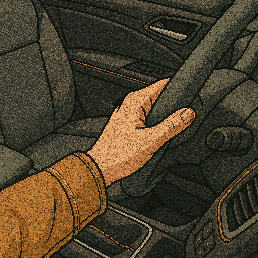
If you want a preview of what fabrics will stop feeling weir and start feeling everyday, get into a few different cars. Ride-share counts. Rental counters count. So does sitting in a friend’s driveway while they show you a new-to-them SUV. Automotive design has a brutal constraint: the material has to wear, clean, and not look sad after sun exposure. When a texture shows up there, it usually means it’s past the experimental stage. And once people touch it daily on a steering wheel or armrest, they’re primed to accept it on a jacket, shoe, or bag without thinking about it.
What I’m mapping right now is the spread of grained, matte surfaces and deliberate contrast stitching. Not luxury-only, either. It’s in mainstream trims: pebble-grain vinyl, tightly woven seat textiles that look like outdoor furniture fabric, and those slightly rubberized, soft-touch panels that used to be reserved for high-end dashboards. The moment those textures become common in mid-tier cars, I expect fashion to lean harder into utilitarian finishes: coated canvas, pebbled leather, matte hardware, and structured shapes that don’t collapse the second you set them down.
My deal-radar habit is to zoom in on the details that cars standardize. Stitching is a big one. Thick thread in a contrasting color is a design choice that travels well across industries because it’s cheap to execute and photographs clearly. When I see that contrast stitch showing up in multiple car brands in the same year, I start scanning for bags and boots where the stitch is the feature, not a hidden construction line. Then I sanity-check durability the way a car designer would: I rub the seam with my thumb, flex the corner, and look for any sign the top layer is just a film that’s going to peel. If it’s genuine leather, the grain should look like it has depth. If it’s coated fabric, the coating should feel even, not sticky.
The payoff is timing. When a texture becomes familiar through cars, shoppers stop treating it like a trend and start treating it like a default. That’s when retailers overbuy it in multiple colors, and that’s when you get the good markdowns without ending up with something that screams a specific year.