
Three on-the-ground tech tells I watch in menus, mirrors, and checkout screens before a trend hits your closet.
QR menus are teaching brands to sell in tiny decisions
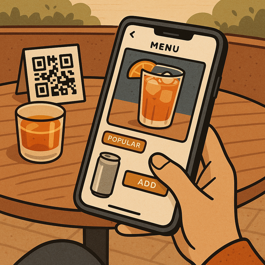
The first time I noticed it, I was waiting on a patio for a friend who was late, scrolling a QR code menu out of boredom. The food was fine, but the interface was the story: a big, glossy photo tile for one cocktail, a little badge that said "popular," and then a nudge to add a canned spritz at checkout. It felt like a tiny e-commerce funnel, except it was attached to a table.
If you want to spot consumer trends before they get loud, watch what QR menus are normalizing. They train people to make fast, low-stakes add-on decisions with almost no friction, and that same behavior shows up later in beauty, apparel, and home. Here are the menu details that matter when you're scanning for what's about to jump categories:
- Default modifiers. When the menu pre-selects the upgrade (extra shot, "make it large," add protein), it is practicing the same muscle as a pre-checked "add the matching bra" box on a DTC site. Defaults beat persuasion.
- One-tap reorders. If the interface remembers your last choice, it is reinforcing brand loyalty through convenience, not love. That is the same logic behind saved sizes, saved fits, and saved shade matches.
- Visual hierarchy. The items with photos and big buttons will get disproportionately ordered. Later, you'll see brands design product pages and in-app shops the same way: fewer choices, larger tiles, and a single obvious path.
None of this is shady by itself. It's just a feedback loop. Once you watch it in restaurants, you start catching the same pattern when a retailer's app quietly adds a sticky "complete the look" bar or when a checkout page turns into a carousel. The tech innovation here isn't the QR code. It's the micro-decision design, and it's teaching shoppers to say yes in smaller bites.
AR try-on isn't the wow factor anymore, it's the lighting
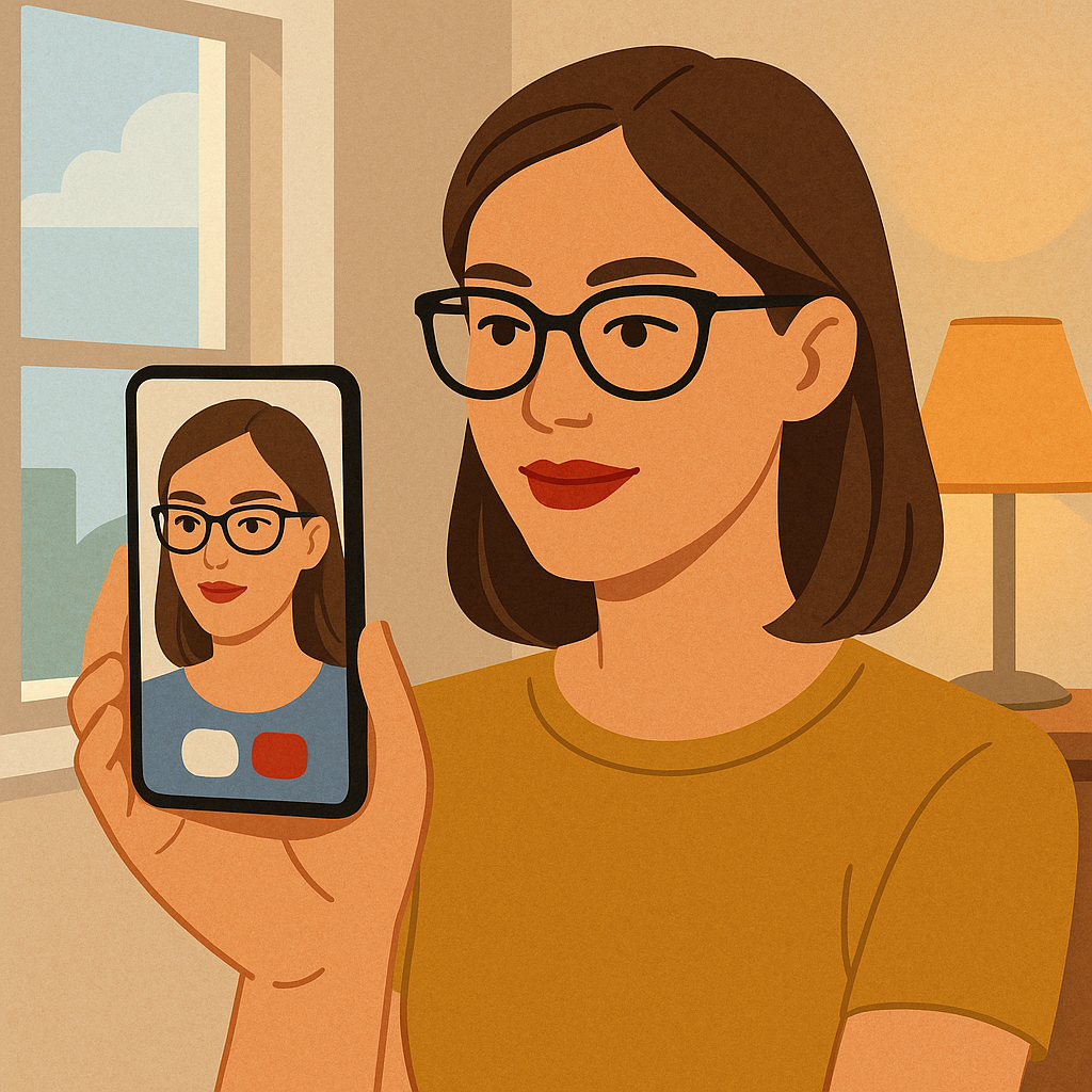
I used to treat AR try-on like a novelty button you hit once, smirk, and then go back to the product photos. Lately, I keep seeing people use it like a final check, especially for makeup shades, glasses, and even hair color previews. The shift isn't that the face filter got fancier. It's that the lighting got closer to the lighting you live in.
When I'm watching for what will influence buying habits next, I don't ask, "Does this AR feature exist?" I ask, "Does it show me in a way that makes me trust it enough to spend?" That trust tends to arrive when three things happen:
- It acknowledges mixed light. If the try-on looks decent when I'm standing near a window and then still looks believable when I pivot toward a lamp, it has crossed into usefulness. Shoppers stop treating it like entertainment and start treating it like information.
- It handles edges. Glasses sit where your glasses sit. Lip color doesn't float above your mouth. Hair color doesn't leave a clean halo around your head. Those little edge mistakes are what make people bail.
- It offers a comparison view. Side-by-side, swipe between shades, or a saved "before" frame. Comparison turns browsing into decision-making, and that changes what gets bought first when a trend is emerging.
Here's the part that shows up in consumer trends: once AR gets good enough to reduce returns, brands start using it to push bolder choices. You see more unusual lip tones, more statement frames, more "try the copper" energy. Not because people suddenly got braver, but because the tech reduces the fear of being wrong. If you want to predict where the next wave of color or silhouette is coming from, look at the categories where try-on is becoming boringly reliable. That's where experimentation becomes normal.
I still don't trust a screen to guarantee a perfect match (your camera, your display, and your lighting are all variables), but I do trust it to tell me what people will be willing to test-drive. And test-driving is where trends start.
Tap-to-pay receipts are turning checkout into a media channel
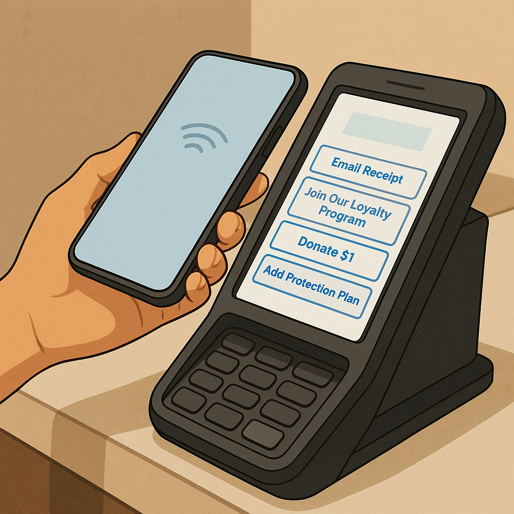
There's a moment at checkout that didn't exist a few years ago: you tap your phone, you get the little beep, and then the terminal doesn't go blank. It lingers. It offers. It asks. That after-the-beep screen is where a lot of consumer trend shaping is happening, and it's being powered by the same payment rails that make tap-to-pay feel effortless.
I started paying attention when I noticed how often the prompts were the same across totally different stores. Donate a dollar. Join the membership. Get the text receipts. Apply your rewards. Add the warranty. It's not just upselling. It's training people to accept ongoing relationships with brands in the literal last five seconds of a purchase.
If you're trying to anticipate what shoppers will tolerate next (subscriptions, bundles, auto-replenish, pay-over-time), watch these specific behaviors around NFC payments and digital receipts:
- Receipt delivery becomes a sign-up flow. When the default is SMS or email, the brand gets a permission slip for future marketing. The receipt isn't documentation anymore, it's the first message in a drip campaign.
- Rewards move from "nice" to expected. If a terminal shows points in real time, people feel like they're losing money when they shop somewhere without that feedback. That expectation bleeds into apparel and beauty fast, especially in brand apps.
- Checkout prompts normalize add-ons. When a screen can offer a $3 protection plan with a single tap, it makes small, frequent add-ons feel normal. That's the same psychology behind extra accessories in-cart and those tiny "complete your set" nudges.
This is why I treat payment UX like trend forecasting, not finance nerd stuff. The friction drops, the prompts multiply, and suddenly consumers will do things they'd have rolled their eyes at when it required a form, a clipboard, or a cashier explaining it out loud. If you want to know what the next accepted habit will be, stand near a self-checkout for ten minutes and watch what people tap without thinking after their phone chirps.