
Hold a plain white tee next to your hangers and you can spot the next palette shift before it takes over your cart.
Start with a white tee and brutal daylight
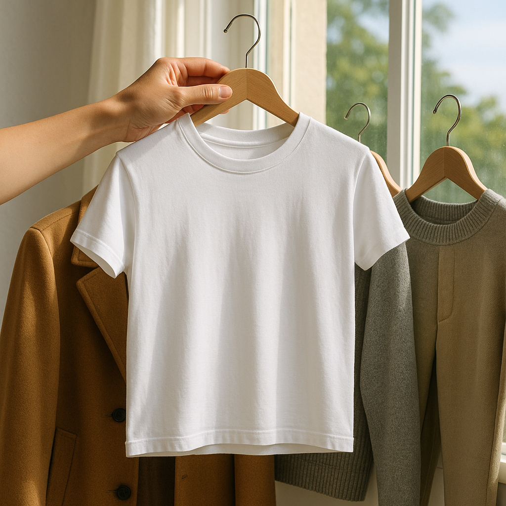
I keep one plain white crewneck tee that never leaves my closet for long, because it’s my quickest lie detector. Not a creamy one, not “optic” that looks blue in photos, just a boring true white. Take it to a window at midday (not the warm lamp in your bedroom) and hold it up to three things: the jacket you wear on repeat, your most reached-for knit, and the pair of pants you consider a neutral. What you’re looking for isn’t whether the pieces match. It’s whether the whole group is quietly drifting warmer, cooler, dustier, or more saturated than it was a year ago.
This is where you catch the palette evolution while it’s still subtle. Maybe your so-called black is reading like ink, your grays are turning mushroomy, and your old camel coat suddenly looks loud and orange. Or your whites look fine, but everything around them is getting paler and more chalky, which is how you end up buying yet another “safe” beige and wondering why your closet feels washed out.
Two practical notes from doing this too many times: (1) do the check on hangers, not on your body. Skin tone and bathroom lighting will trick you. (2) grab the actual items, not a photo. Phone cameras auto-correct and make everything look harmonized. Once you see the drift, jot four words on a sticky note right on your clothing rack: war or cool and sof or clear That’s your current direction, and it’s the thing trend colors will latch onto when they start sneaking into your purchases.
The hanger gradient: arrange by color family, then squint
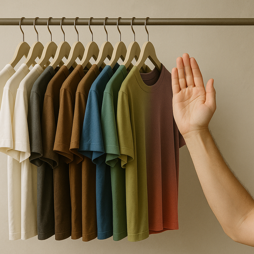
Here’s the move that makes you feel a little unhinged for 12 minutes, and then you never stop doing it: pull every top (tees, button-downs, sweaters) and hang them in a gradient by color family. Start with white, then cream, then light gray, charcoal, black. Then do browns, then blues, then greens, then reds/pinks, then the weirdos (mustard, lilac, whatever you swore you didn’t own). Use the same hanger style if you can, because mixed hangers add visual noise and you miss the point.
Now step back and squint. I’m serious. Squinting blurs detail and leaves you with temperature and value. This is where you see the palette evolution as a shape. A few patterns I keep noticing in real closets: the neutra section slowly fills with softer midtones (stone, putty, smoke) and your true black becomes a tiny slice. Or the opposite, where your wardrobe gets higher contrast without you meaning to: crisp black, bright white, and one strong accent color you keep buying because it photographs well.
When a trend color is about to peak, it often shows up first as a near-neutral cousin. Think of the way olive slides in before bright green, or how dusty rose arrives before hot pink. In your gradient, those early adopters look like a new stripe forming. If you see, for example, a sudden pocket of desaturated blue-grays gathering in the middle of your blues, that’s not random. That’s you already moving toward a mood. And if you don’t like where it’s heading, this is the moment to stop it by deciding what your bridg color is (maybe navy instead of slate, maybe chocolate instead of taupe) before your next cart quietly completes the trend for you.
Dye-lot déjà vu: the dupes that signal a peak is coming
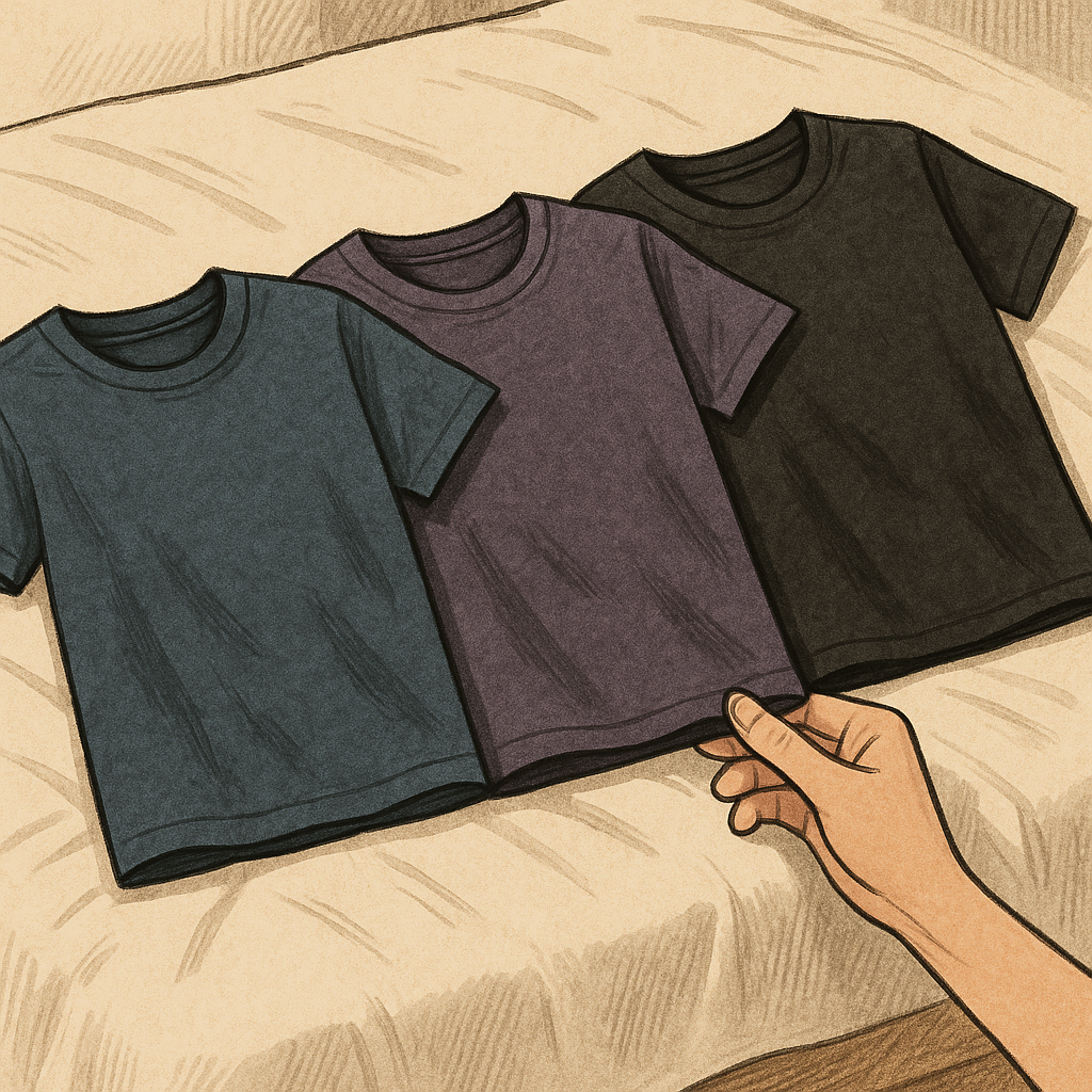
I learned this one the annoying way: I bought what I thought was the same nav tee three times over a couple of seasons, and none of them matched. One leaned purple, one leaned green, one was almost black. When I lined them up on my bed, it wasn’t a quality-control mystery. It was a palette shift happening in slow motion, with brands chasing whatever read freshest on a product page.
So do a quick dye-lot check inside your own closet. Pick one color you think you own a lot of (black, navy, camel, olive, denim blue) and pull every piece in that family. Lay them on a flat surface under daylight. Don’t judge them one by one. Compare edges. Where you see the biggest spread, that’s where the market has been nudging you. Your came might now range from sandy beige to orange tan, which means that warm, golden brown wave is probably near its loudest point. Or your gra might have migrated toward greenish greige, which usually happens right before every brand drops a whole set of matching separates in that exact tone.
What I do with this info is simple and kind of ruthless: I pick the version I like best and treat it as my anchor. Then I stop buying the in-between shades, because those are the ones that clog a closet and make outfits feel slightly off. If you’re unsure, use one easy rule: keep the shade that makes your shoes and belt look intentional. If your leather bag suddenly clashes with half your supposed neutrals, it’s not your bag’s fault. It’s the color trend creeping in through your basics, one almost-the-same purchase at a time.